3 绘图
LaTeX 中“正确的”绘图包是TikZ/PGF。它适用于图片排版。如果是函数图,你可能愿意先在 R 或 Mathematica 里看看图长啥样,再用 TikZ 排版。
TikZ 可以调用 gnuplot 作图,也可以用 pgfplots 包。后者的基本思想是用户只负责提供公式或数据,其它由 pgfplots 帮你搞定。
3.1 pgfplots
主要参考:pgfplots manuel 和 gallery.
输入 \usepackage{pgfplots}, 同时设置\pgfplotsset{compat=1.9}
以兼容不同版本。
LaTeX 本身不是作图语言,生成多个图片时可能耗时较长。可考虑先导出生成的 PDF 图片,然后再载入
下面来看两个具体的例子,均来自这篇教程。
3.1.1 函数图像
绘制两条抛物线。因为 pgfplots 基于 PGF,所以要在 tikzpicture 环境下使用。
\begin{tikzpicture}
\begin{axis}[
    axis lines = left,
    xlabel = $x$, ylabel = {$f(x)$},
    ymax = 130
]
%Below the red parabola is defined
\addplot [
    domain=-10:10,
    samples=100,
    color=red,
]
{x^2 - 2*x - 1};
\addlegendentry{$x^2 - 2x - 1$}
%Here the blue parabloa is defined
\addplot [
    domain=-10:10,
    samples=100,
    color=blue,
    ]
    {x^2 + 2*x + 1};
\addlegendentry{$x^2 + 2x + 1$}
\end{axis}
\end{tikzpicture}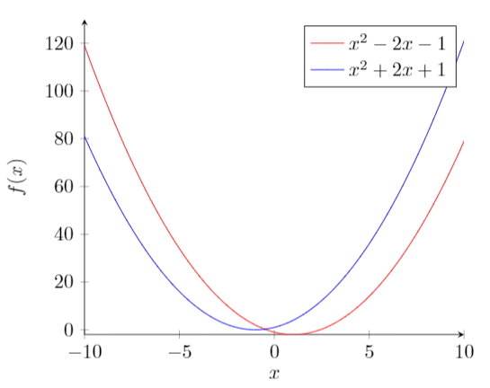
逐行分析:
axis lines = left
生成“坐标轴”。默认情形是一个四边方框。xlabel = $x$andylabel = {$f(x)$}
坐标轴标签ymax = 130
若无此命令,程序自动将y最大值设为 120,不够美观。\addplot
绘制函数图像domain=-10:10
自变量范围。samples=100
domain 中的抽样次数。次数越多图像越 sharp, 所需生成时间更长。\addlegendentry{$x^2 - 2x - 1$}
标志 \(x^2 - 2x - 1\).
以上。蓝色抛物线分析类似。
3.1.2 数据作图
和函数图类似,也可以根据载入的数据作图。全部例子见此.
3.2 ggplot2
也可直接用 ggplot2 绘图,再另存为 pdf 后插入论文。
ggplot2 包提供了 stat_function进行函数作图
# Define your function
fun.1 <- function(x) sin(x)

# initialize the data set and then add layers
ggplot(data.frame(x = 0), mapping = aes(x = x)) +
    stat_function(fun = fun.1) + xlim(-5,5)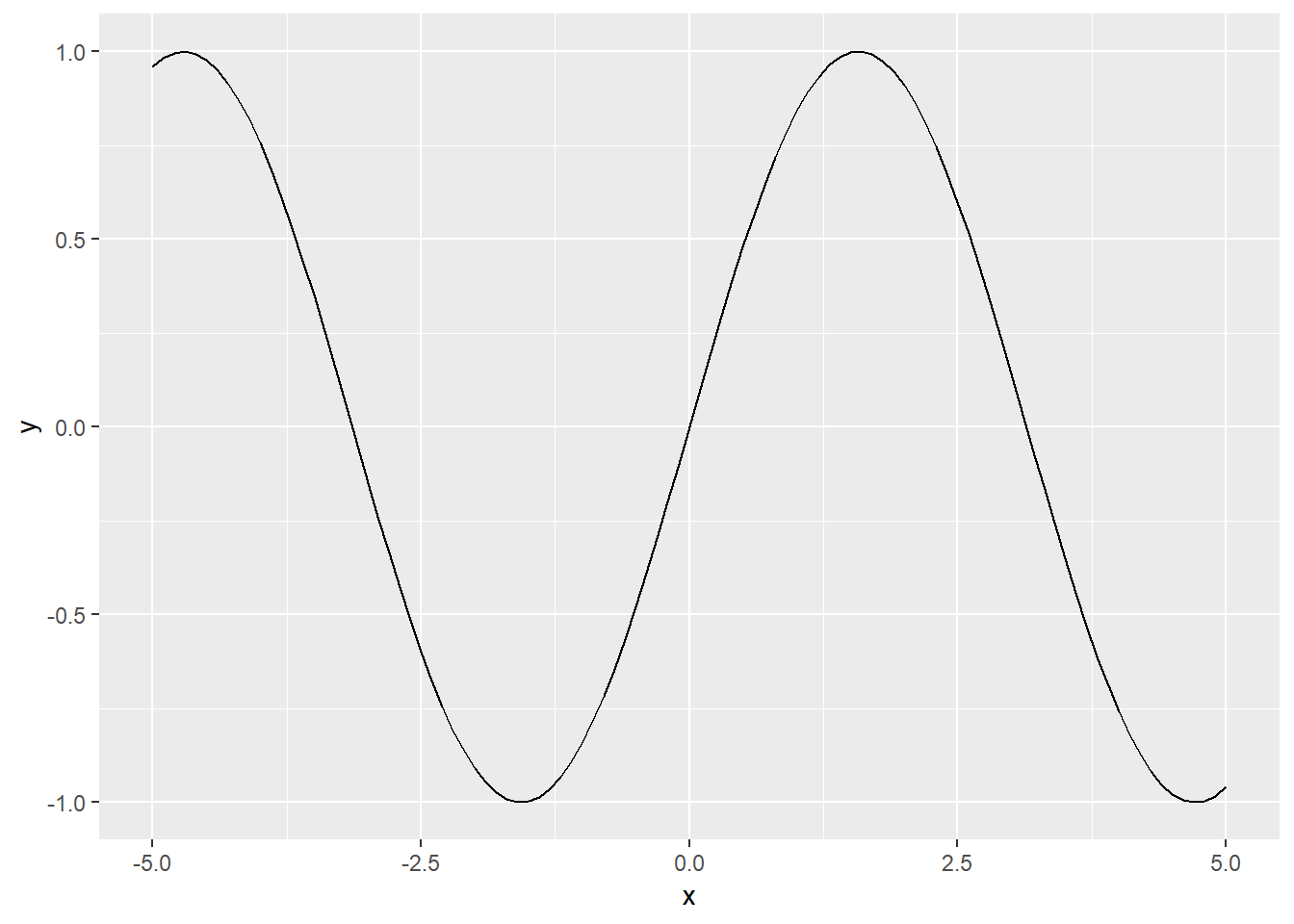
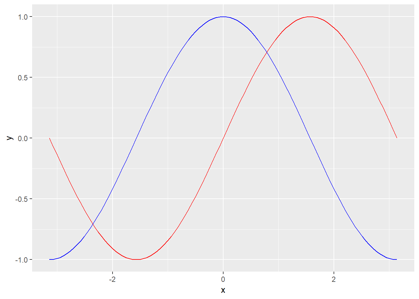
如果想在一张图里放入多个函数图像
# Define your function
fun_1 <- function(x) sin(x)
fun_2 <- function(x) cos(x)
# fun_3 <- function(x) tan(x)

ggplot(data.frame(x = 0), mapping = aes(x = x)) + xlim(-pi,pi) +
    stat_function(fun = fun_1,colour = "red") +
    stat_function(fun = fun_2,colour = "blue")